Furniture

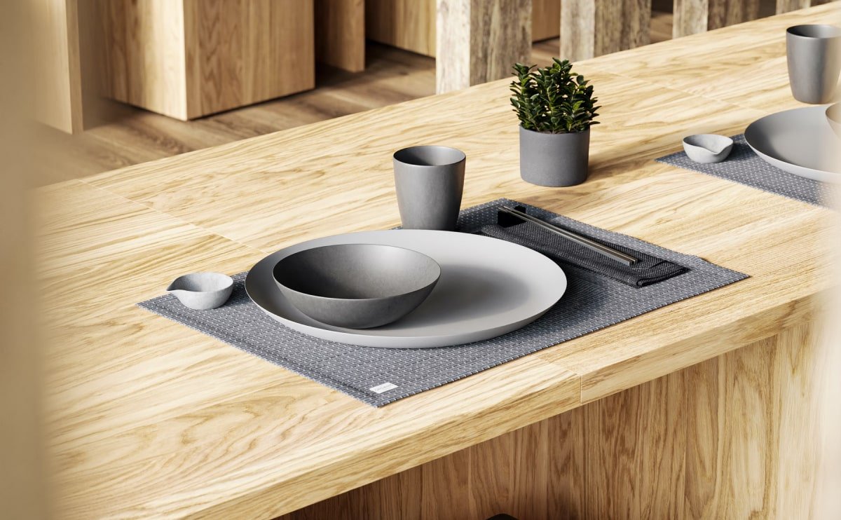
Ethimo mountain style
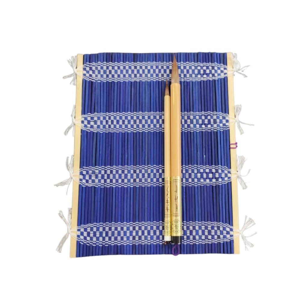
So how did the classical Latin become so incoherent? According to McClintock, a 15th century typesetter likely scrambled part of Cicero’s De Finibus in order to provide placeholder text to mockup various fonts for a type specimen book. It’s difficult to find examples of lorem ipsum in use before Letraset made it popular as a dummy text in the 1960s, although McClintock says he remembers coming across the lorem ipsum passage in a book of old metal type samples. So far he hasn’t relocated where he once saw the passage, but the popularity of Cicero in the 15th century supports the theory that the filler text has been used for centuries.

Don’t bother typing “lorem ipsum” into Google translate. If you already tried, you may have gotten anything from “NATO” to “China”, depending on how you capitalized the letters. The bizarre translation was fodder for conspiracy theories, but Google has since updated its “lorem ipsum” translation to, boringly enough, “lorem ipsum”. One brave soul did take a stab at translating the almost-not-quite-Latin.

According to The Guardian, Jaspreet Singh Boparai undertook the challenge with the goal of making the text “precisely as incoherent in English as it is in Latin – and to make it incoherent in the same way”. As a result, “the Greek ‘eu’ in Latin became the French ‘bien’ […] and the ‘-ing’ ending in ‘lorem ipsum’ seemed best rendered by an ‘-iendum’ in English.”

Find Your Focus While Working

As an alternative theory, (and because Latin scholars do this sort of thing) someone tracked down a 1914 Latin edition of De Finibus which challenges McClintock’s 15th century claims and suggests that the dawn of lorem ipsum was as recent as the 20th century. The 1914 Loeb Classical Library Edition ran out of room on page 34 for the Latin phrase “dolorem ipsum” (sorrow in itself). Thus, the truncated phrase leaves one page dangling with “do-”, while another begins with the now ubiquitous “lorem ipsum”.

Whether a medieval typesetter chose to garble a well-known (but non-Biblical—that would have been sacrilegious) text, or whether a quirk in the 1914 Loeb Edition inspired a graphic designer, it’s admittedly an odd way for Cicero to sail into the 21st century.

جا قلمی حصیری ژاپنی

500,000 تومان

جا قلمی حصیری از بامبوی طبیعی، مخصوص خوشنویسی ژاپنی. دارای تهویه مناسب برای خشک شدن قلم و جلوگیری از پوسیدگی، سبک و قابل حمل. اندازه: ۲۶۰×۲۰۰ میلی‌متر.

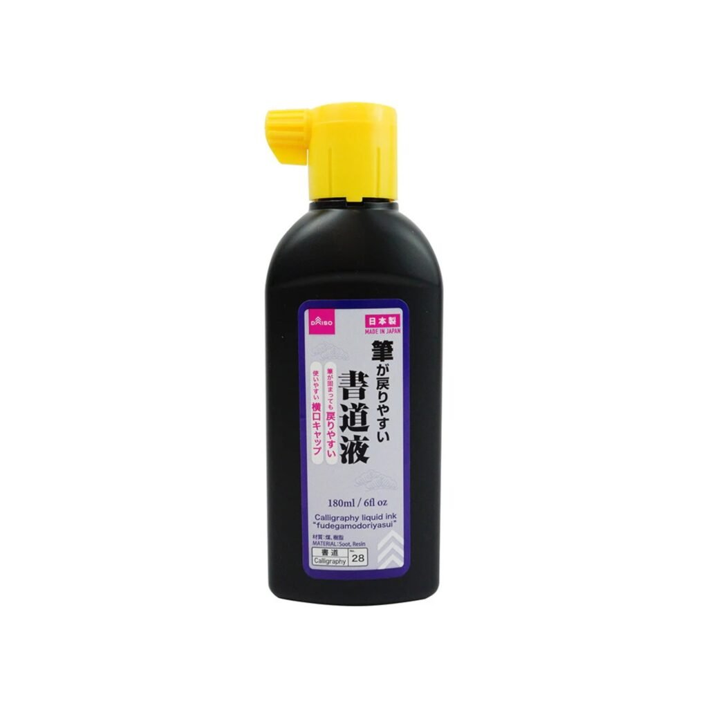
جوهر خوشنویسی ژاپنی دایسو (مایع)

750,000 تومان
جوهر خوشنویسی مایع (Fudegamodoriyasui Shodō-eki) – ۱۸۰ میلی‌لیتر
جوهر آماده به کار دایسو، مناسب خوشنویسی ژاپنی. به راحتی از قلم پاک می‌شود و تمیزکاری آسان دارد. فقط برای خوشنویسی استفاده شود و دور از دسترس کودکان نگهداری شود.

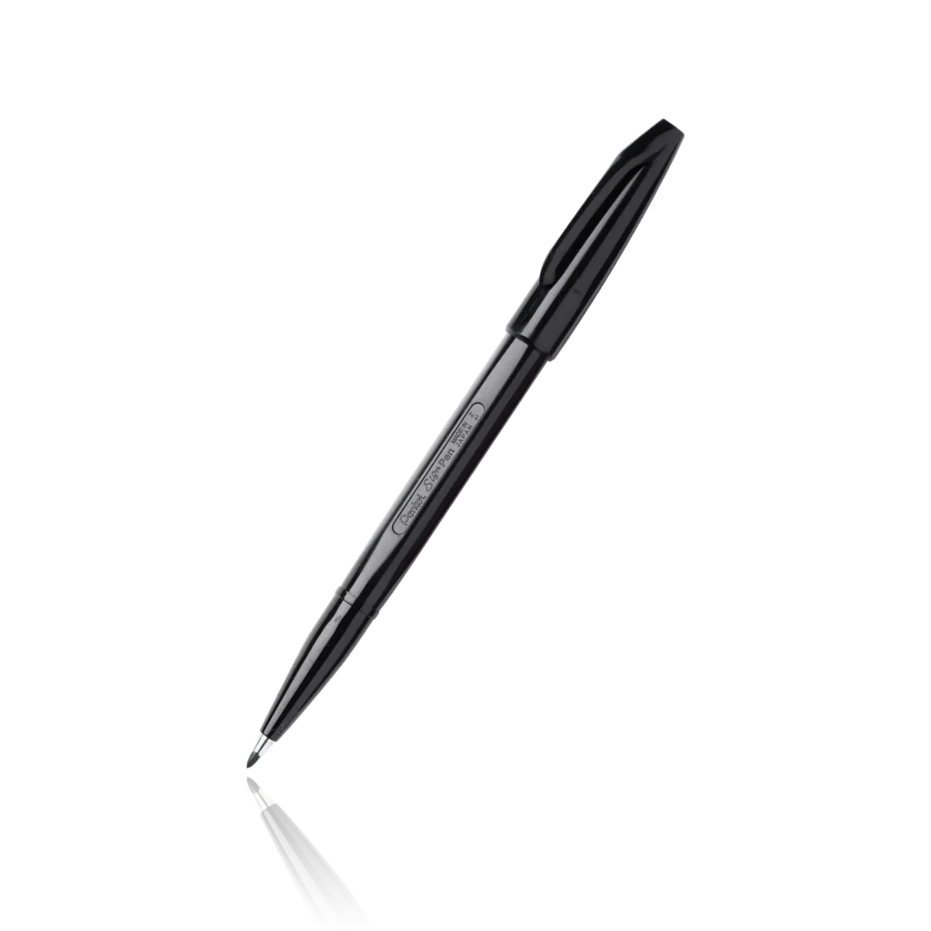
خودکار Pentel Sign Pen (پنتل ژاپن)

300,000 تومان
خودکار Pentel Sign Pen با جوهر بر پایه آب و نوک باریک، انتخابی عالی برای نوشتن روان و طراحی دقیق است. محبوب جهانی از سال 1963 تا امروز.

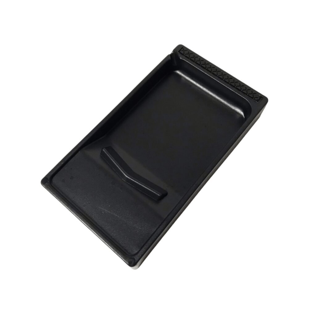
سنگ جوهر خوشنویسی ژاپنی

قیمت اصلی 900,000 تومان بود.قیمت فعلی 800,000 تومان است.

سنگ جوهر دوطرفه Daiso
سنگ جوهر سبک و بادوام دایسو با طراحی دوطرفه: سطح جلویی برای سابیدن مرکب جامد و پشت آن به عنوان حوضچه جوهر مایع. مناسب دانش‌آموزان و علاقه‌مندان به خوشنویسی، با لایه ضد لغزش برای استفاده ایمن و آسان.

دیدگاهتان را بنویسید

نشانی ایمیل شما منتشر نخواهد شد. بخش‌های موردنیاز علامت‌گذاری شده‌اند *